RESEARCH | INFORMATION ARCHITECTURE | INTERACTION DESIGN
USER INTERFACE DESIGN | INTERATION AND IMPLEMENTATION
USER INTERFACE DESIGN | INTERATION AND IMPLEMENTATION
Background
RB sources is a company that sells artisan products that are both ethical and high quality. The owner and founder, Regan, was drawn towards Guatemala for its rich history of textile weaving. The current and upcoming product lines are mainly sourced from Guatemala, however, RB sources would eventually expand to other countries in the future.
Regan has another brand called RB interiors design, her wish is to build RB sources that could compare with what she sourcing for her interior design clients.
After a few years to build the company, Regan eventually decides to start a responsive website that users could place orders directly and no need to call for quotes.
Challenge
The main challenge of the project is to make a brand new e-commerce website that is part of the owner’s other interior design business, meanwhile, has its own style and audience. For a real-life project, it is also a challenge to communicate with the founder about research findings and design choices while managing business constraints. The company needed a responsive website, a new logo, and branding that falls under the interior design brand and reflects the values of high-end quality, artisan stories, and unique designs.
Key Focus
Style: Clean and sophisticated UI design that matches with the high-end and family-friendly home products.
Navigation: Consistent, clear, and easy to use and find items through the site.
Context: Provide more than just products, but also a site with story-telling and inspirations.
Research
Process: Empathize - Define - Ideate - Prototype - Testing - Iterate
Research goals
• To find design patterns from interior/home design websites about how to enhance the customer experience online from entering the site to check out, and what can the website bring to them other than products.
• Learn how people’s behavior when shopping for interior/home products online.
• To gain more knowledge about current trends and industry.
Competitive Analysis
To better understand the market of home products/artisan goods and design patterns of e-commerce websites that sell home goods and furniture. I analyzed each competitor’s website strengths and weaknesses on the features, user-flow, information architecture, and UI design.
Takeaways
• Too many stories and blogs could take away the attention of the product itself.
• The customized process is easy to order and has clear expectations.
• Either no reviews or enough good reviews for the majority of products.
• Each item page has a good amount of information about the product, as well as other resources (shipping & return, product care, similar products).
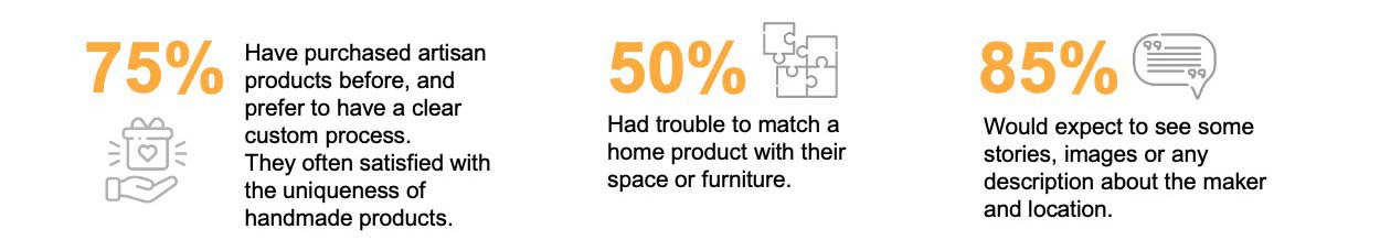
User Interviews
In order to understand what information and content users want to see in order to have a better shopping experience online. I targeted two groups of people who are either in the creative field or family orientated.
The top factors shoppers looking for:
• Details of products: material quality, dimensions, clear photographs
• Customer services: delivery time and cost, shipping and return, customization options.
• Branding: story behind the production, location of products made from, customer reviews.
Define
Persona and Empathy Map
Based on my market research and interviews, I created two ideal personas called Kelly and Stephanie. Kelly represents the customers who like creative and artistic things, care about colors and textiles to match or fit the space, and also care about where the product comes from and how they were made. Stephanie reflects the group who are family orientated, looking for good quality and durable items that are family-friendly, and have a busy schedule lifestyle.
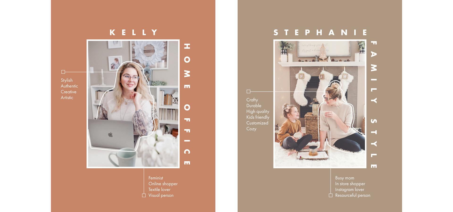
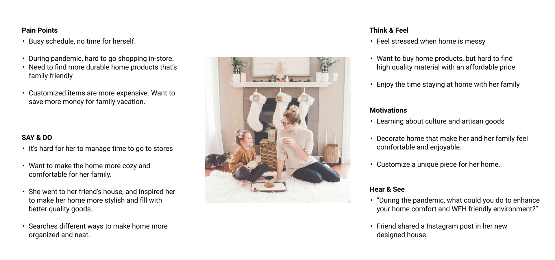
In one of the personas, I focused on Stephanie for the empathy map that best represented the user’s viewpoints and understood deeply how the environment and things around the type of users could influence their buying decisions. Here are three top points I found:
• She needs to find more durable home products that are family-friendly but also high quality.
• She has a busy schedule and is frustrated about spending too much time to find the right piece online.
• Customizing a unique piece for her home motivates her to purchase a new home product/furniture.
Information Architecture
Sitemap
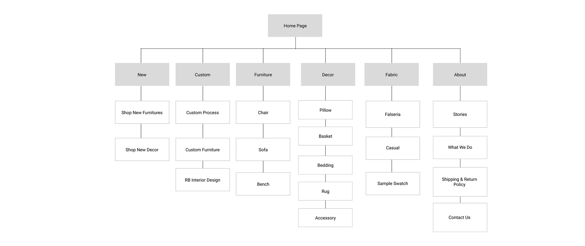
Based on my research finding of competitors’ websites structure, while keeping my user interviews in mind, I built a site map. The main goal of this exercise is to communicate the hierarchy and structure of the site. After I get the information from the client about the product lines and what content could help users to learn more about the brand, I grouped the items into different types of categories. My goal is to make the information architecture to be simple and easy to navigate, so I kept the navigation bar short and straightforward compared to other competitor’s websites.
When I shared my sitemap, the client didn't fully understand the structure and I explained it in more detail and why they were in different groups. As a UX/UI designer, it is important for us to explain our reasons and decisions during the design process to stakeholders.
Interaction Design
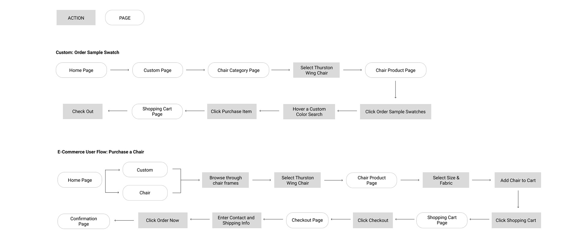
User Flow
I created a user flow for the perona Stephanie who wants to purchase high quality and well-designed chair for her new furnished house, but she’s unsure about the custom fabric. I created two flows to complete the task: one where the user initially intended to purchase a chair but decided to order a sample to see the quality and colors. Another one where she was satisfied with the fabric and placed a customized order online.
Ideate
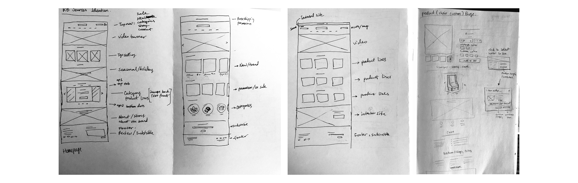
Sketches
I created some options for all the main pages and pulled some elements from each to build the mid-fidelity wireframes. The owner had some beautiful videos of the artisans making products in Guatemala, so I want to make sure that is on the top of the website.
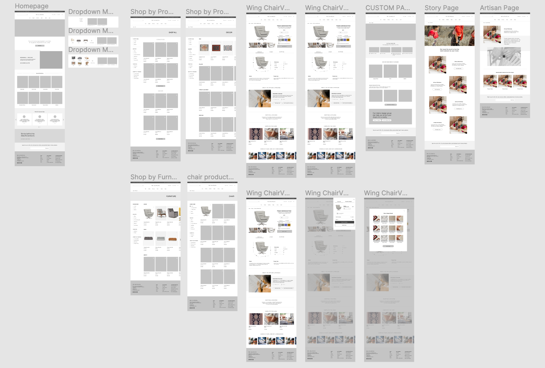
Wireframes
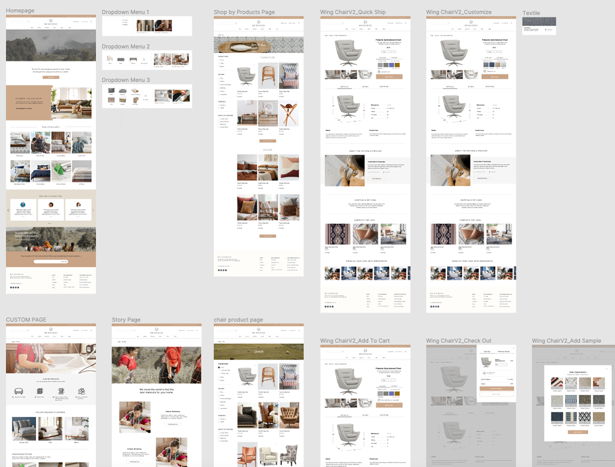
During the wireframe stage, I tried to translate interview and research findings into a website. Based on my user flow of ordering a customized chair, I built the pages (homepage, product page, item page, custom page) to complete the task. In order to better build the prototype, I placed some images to help users to understand the content better.
Besides that, I also built the ordering sample feature - the client assumed people who were unsure about the quality and color prior to purchasing could order textile samples. It's worth testing it out to see if the solution assumption can be validated.
Prototype
Usability Test
I created a prototype on Figma using the wireframes and conducted the usability testing result from three participants. When I shared the sitemap with the owner, she wasn’t sure about the custom page whether it is necessary to be on the menu. I took that in mind for the user testing.
Test objectives:
• Evaluate the usability of the website based on five categories: learnability, efficiency, memorability, errors, and satisfaction.
• Observe the path users take to complete the task of ordering a customized chair.
• Discover whether users would order samples when asked about how to make sure the quality and color are the same as they expected.
• Uncover any areas of inefficiency or confusion for users.
Testing Results:
• All participants completed the test with zero errors.
• All participants didn’t want to order a textile sample prior to ordering the chair. One participant would order if it’s free.
• 100% of participants think the navigation bar is easy to understand and find the item.
• 60% of participants were confused about the two brands’ tabs on the top of the menu.
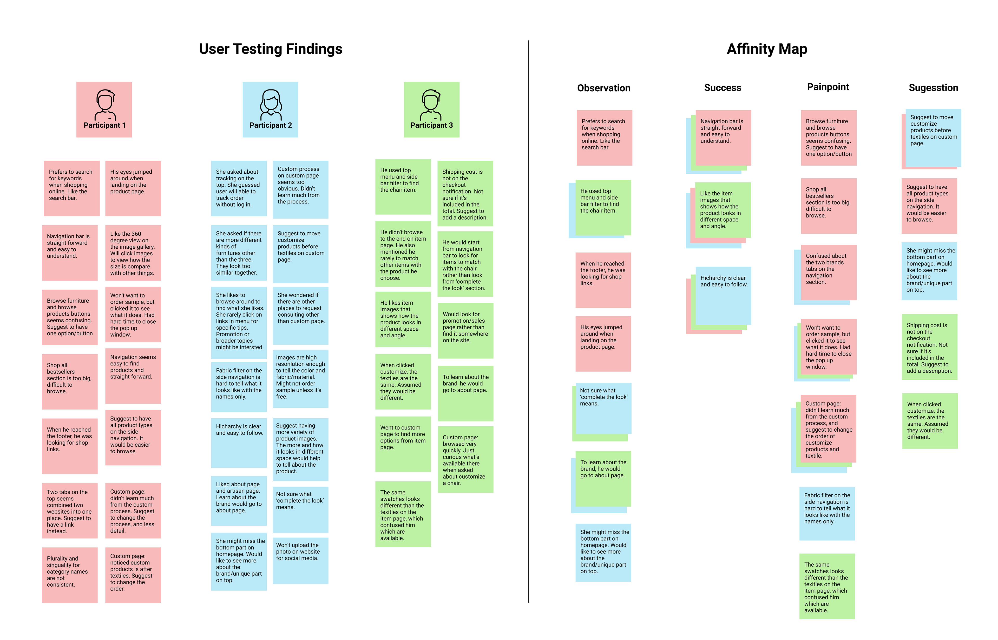
Affinity Map
I created an affinity map based on the user testing findings and identified the key points under observation, success, pain points, and suggestions.
Priority Revisions
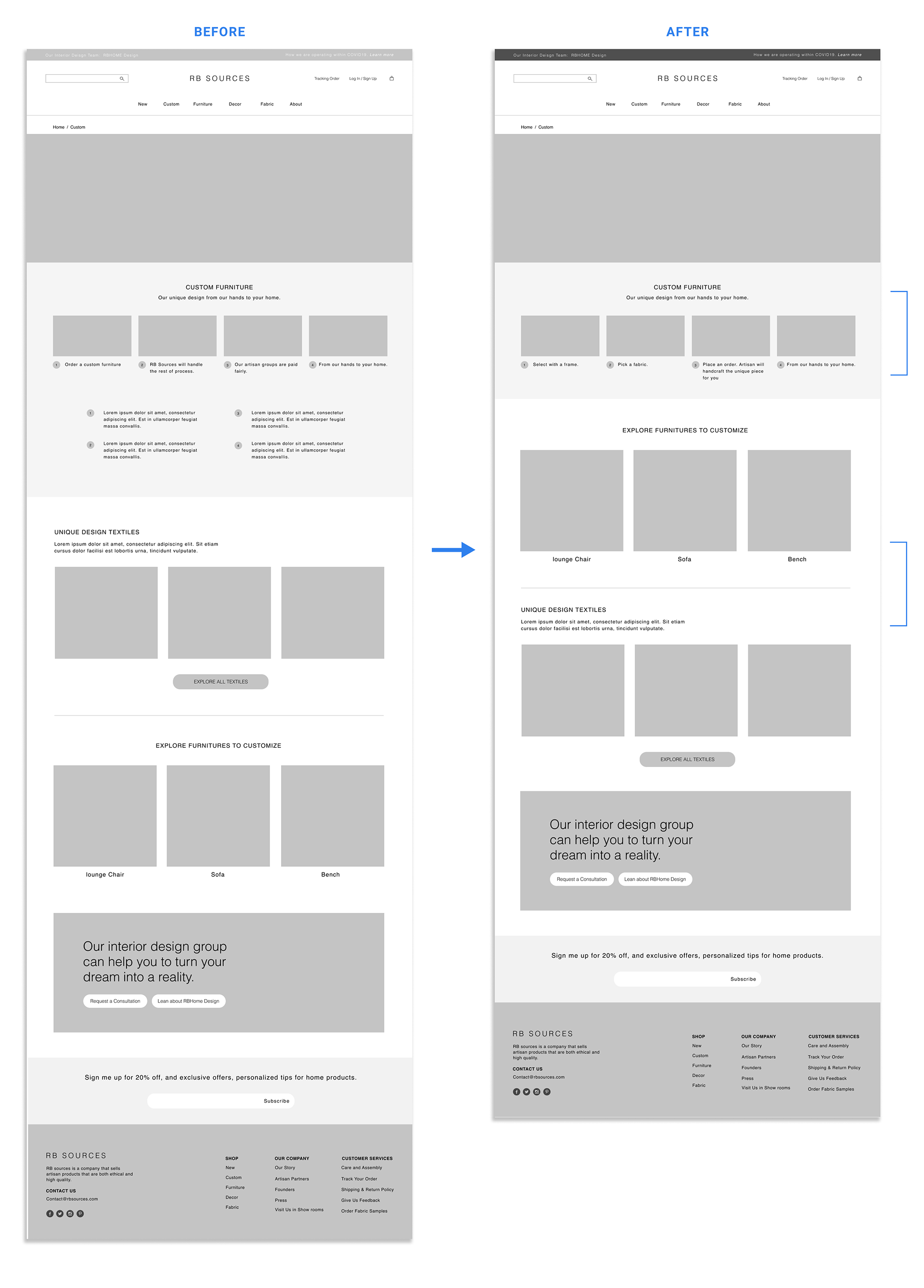
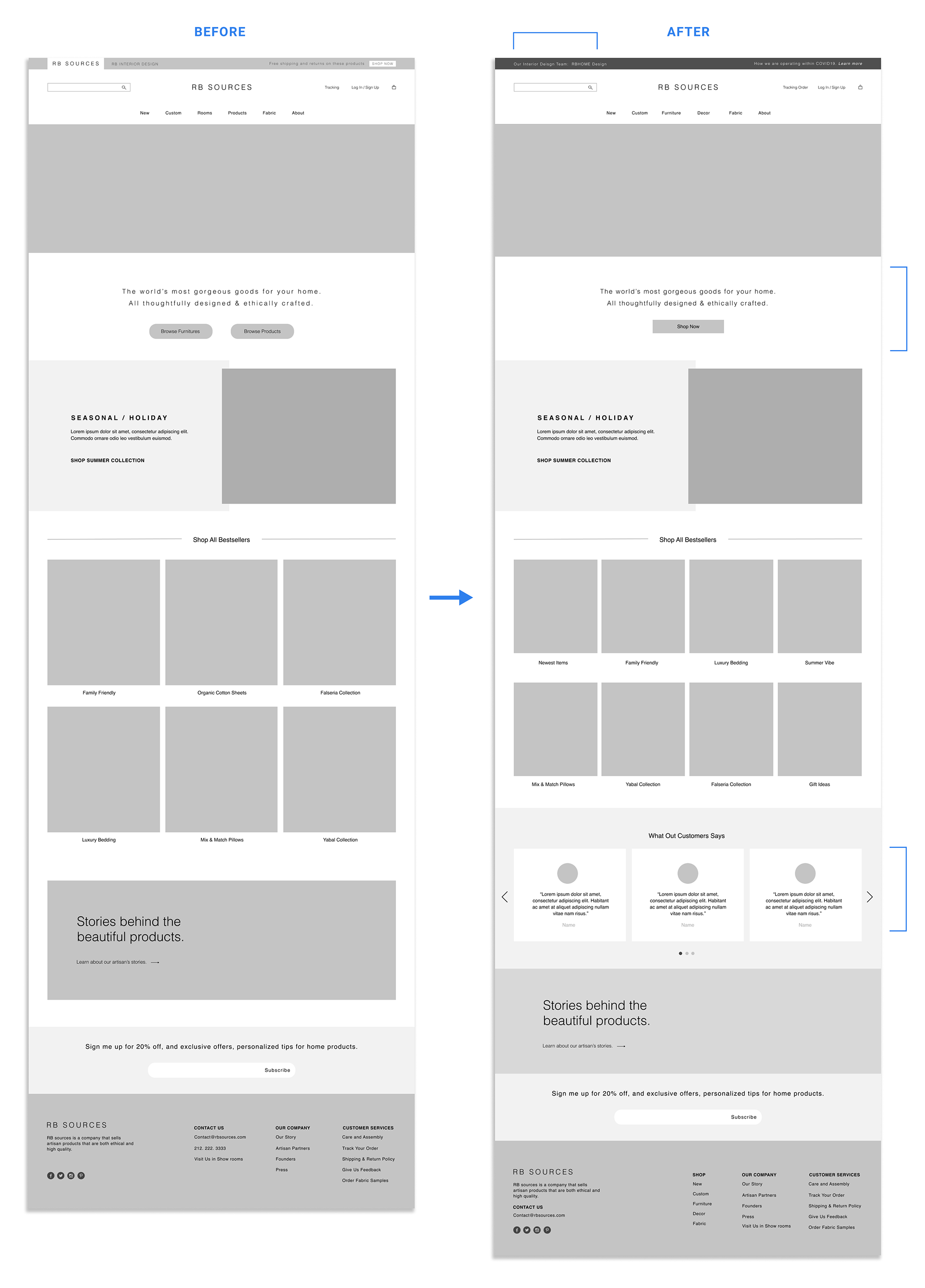
Based on the affinity map, I first prioritized the edits focusing on enhancing the experience of ordering customized item flow. The top problems are unclear the custom process on the custom page, undefined of the CTA buttons on the homepage, and unsure about two brands tab from the navigation bar. Then I addressed the problem from the owner’s feedback, missing a review feature. I recommended leaving it out from the item page until she gets enough reviews for the majority of products. My goal is to make sure users can navigate to the pages they are looking for without friction.
To address these problems, I made the following updates:
Custom page:
• Rewrote the custom process to be more straightforward and easy to understand.
• Moved the customize furniture section up based on user testing feedback on content hierarchy.
Homepage:
• Changed the brand’s tab to a link so that it’s less confusing. That way the RB Sources website still connects with the interior design website as the owner initially plans to do.
• I decided to simplify the buttons from ‘browse by furniture and browse by product’ to one button ‘show all,’ and reword the ‘product’ to ‘decor’ on the menu.
• I decided to add a testimonial section on the homepage so that the owner can update them as she gets the new reviews from customers. That way users can still learn about the brand from other’s reviews in one place without wondering why some of the product doesn’t have reviews.
User Interface Design
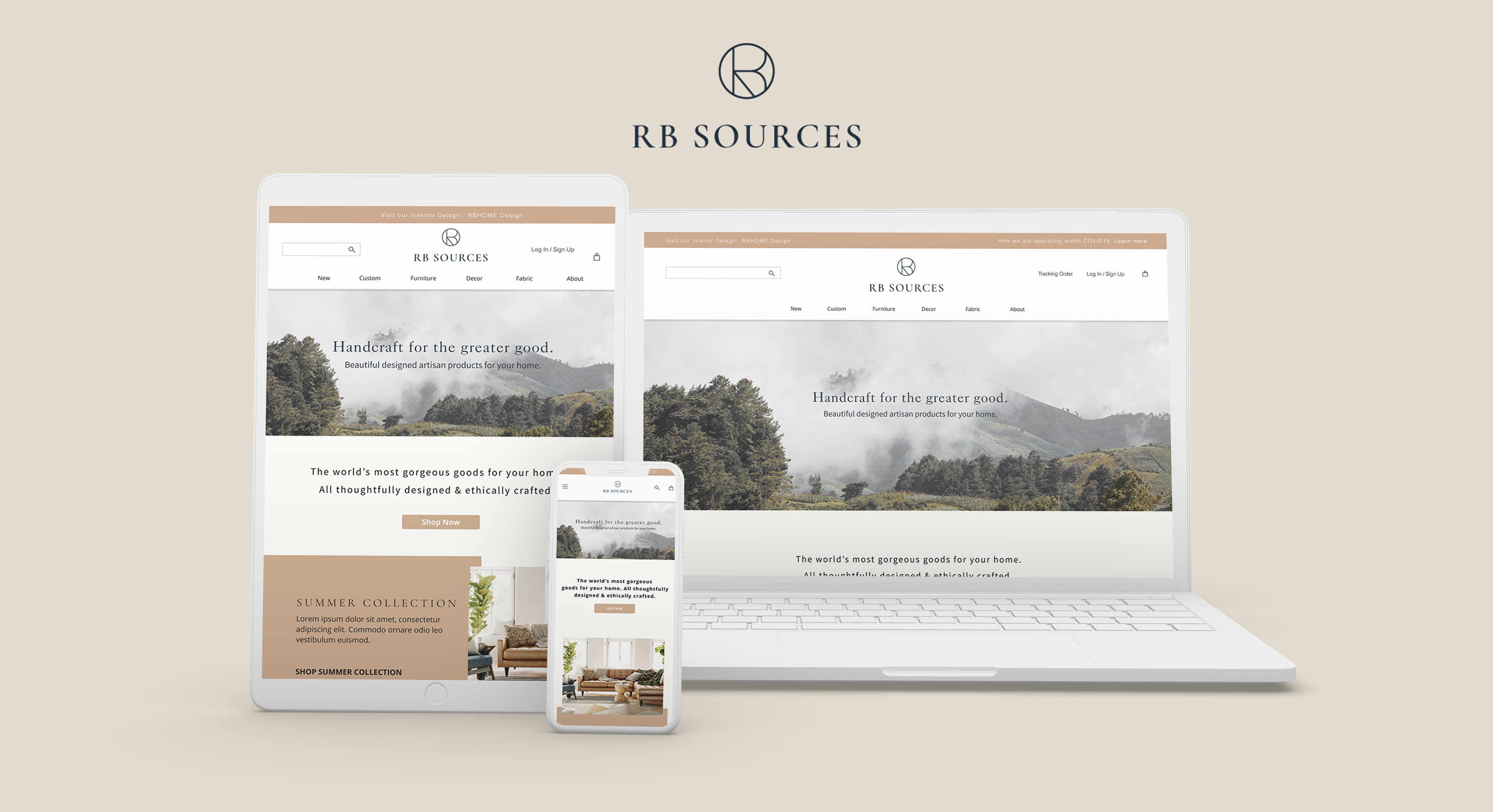
Logo Design and Style Tile
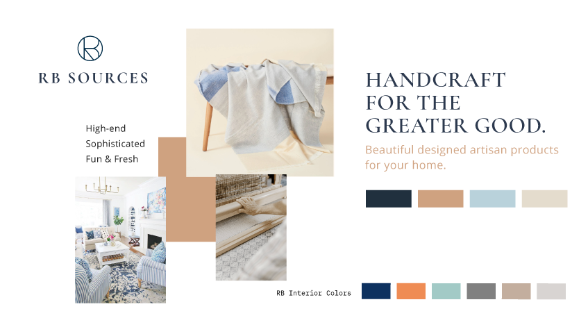
Taking my research, persona, and client discussion into consideration, I developed the branding of RB Sources. The client already has a very strong direction of the company’s branding that is high-end and family orientated, so I worked with her to balance her idea with a more professional look. In order to match the brand with her other RB interior design brand, I took the same icon and used another font to differentiate. The color scheme was inspired by the images of the artisans and the nature in Guatemala, I also made sure the color of the two brands looked like in the same family.
Interaction and Implementation
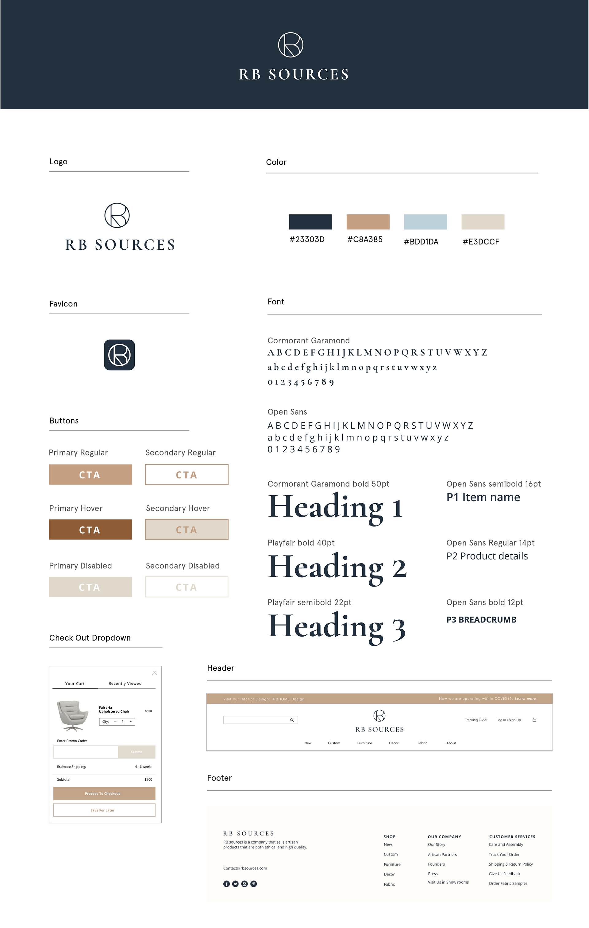
UI Kit
Then, I created a UI kit with branding and other interactive elements that would keep the design consistent and easy to pass on to other designers and developers.
Final Designs
High-Fidelity Prototype
In addition to the priority revisions, I applied the UI design to the final prototype. The purpose of the high-fidelity prototype is to bring everything together to life. Next, I would work with the client together to make adjustments if needed based on the final product lines.