Team: Architect designers, web developer, brand strategist, visual designer
Role: UI/UX design, graphic design
Method: Usability heuristic review
Applications: Adobe XD, Adobe illustrator and photoshop
Project Objective
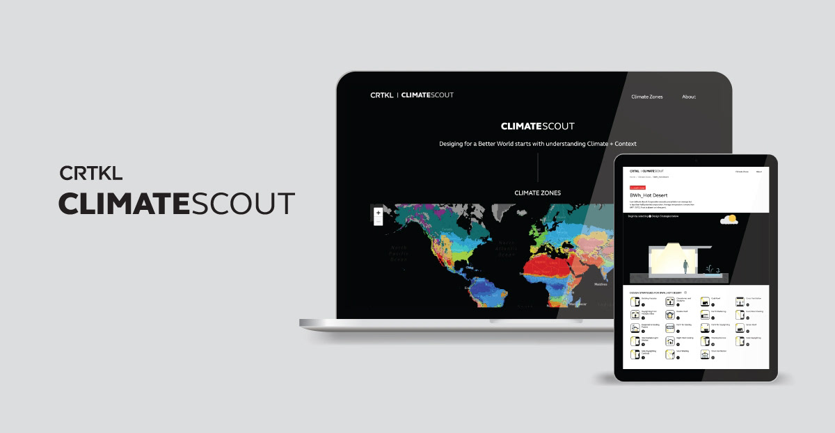
CLIMATESCOUT is a web-based application for climate analysis by pairing the Köppen-Geiger climate classification and building scale design strategies from Architecture 2030’s Palette. The idea is to have a tool that users could interact and view the diagram changing while selecting the design strategies, which provide an immediate visual connection between climate and building response.
Project Goal
Not changing the initial concepts of their app, but enhancing the usability and user interface as well as visual language to align with our current website and brand.
Challenge 1
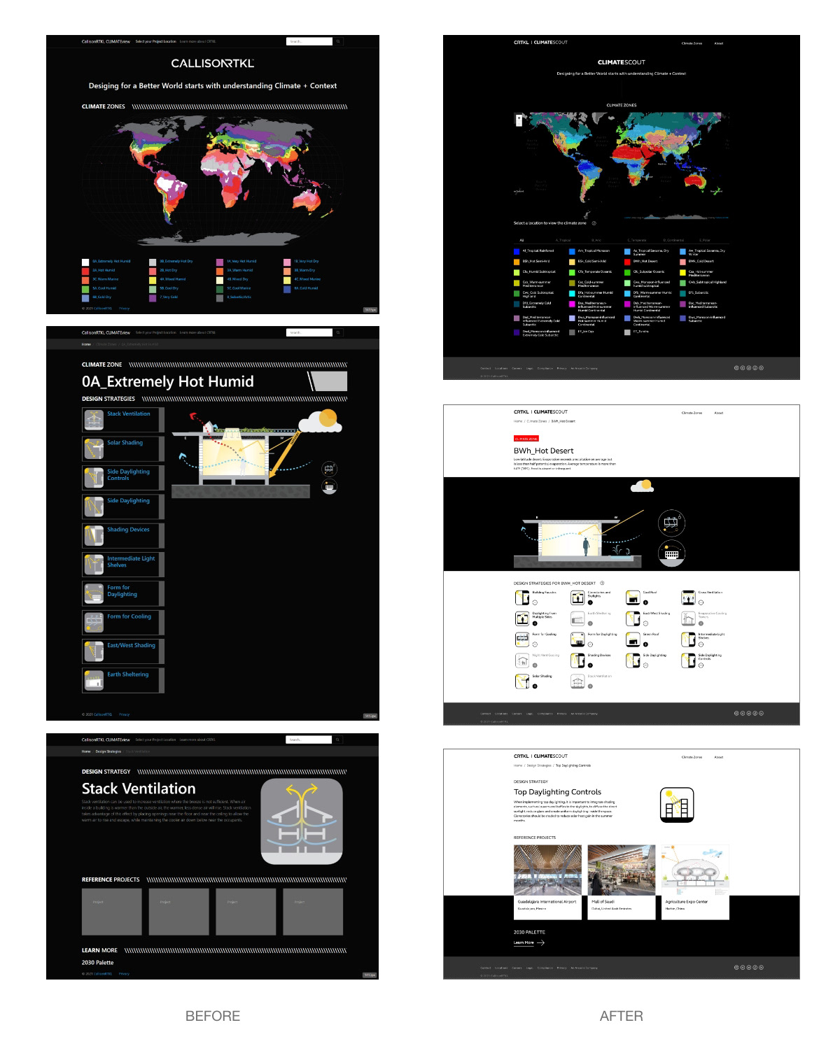
Enhance the map interactivity. Climate zone names are too long, how can we better filter the climate zones?
Solutions
1. Make the climate zones on the map clickable so that people can find the climate geographically.
2. Filter the climate zone list on the bottom by groups to provide flexible routes for different users
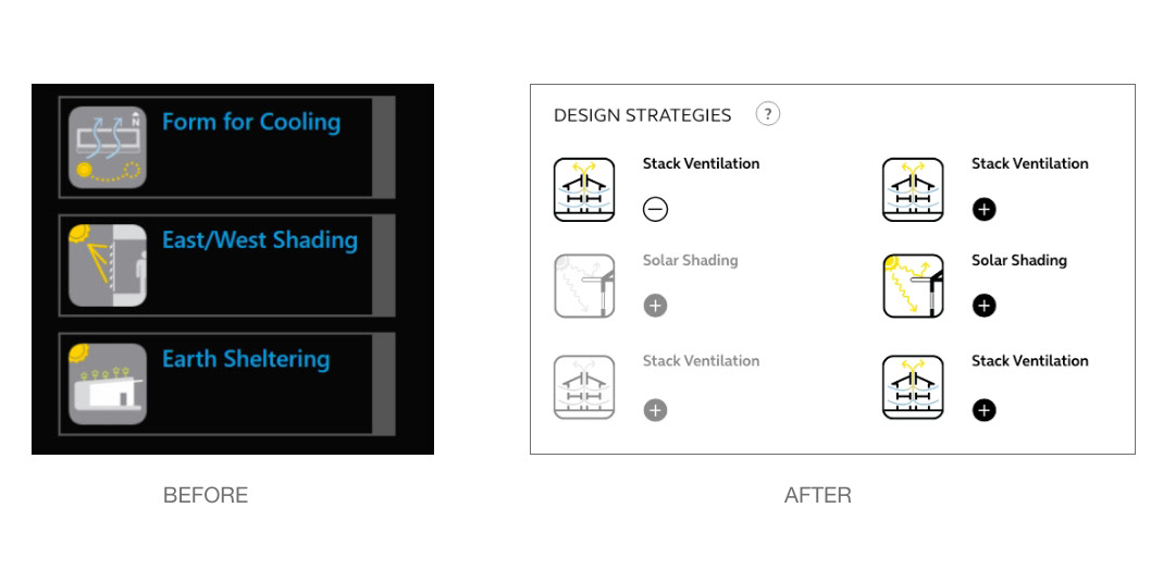
Challenge 2
1. Design strategies icons are hard to see with gray color mixed with yellow on the black background.
2. Functionality of the icons doesn’t work smoothly, slips error could occur when users temp to make selections.
2. Functionality of the icons doesn’t work smoothly, slips error could occur when users temp to make selections.
Solutions
1. Enhance the legibility of the icons by changing the colors to black and white that match with the overall redesign that is simplified and modern.
2. Prevent user mistakes by separating the selection of the icon itself to learn more and add/remove icons. When users select a certain strategy, gray out the ones that are not selectable.
3. Add a hover question mark for help to assist users in making selections.